Categories
Tableau Tips

Quick Tip: How to develop more efficiently with big data sets Tableau Desktop

It’s Quick Tip time for Tableau Desktop!

Do you work with large non-local data sets? For example, something like a live connection to Snowflake or SAP HANA?

If so, you’ve come across frequent loading screens when you switch dashboards or worksheets. This is when Tableau is querying the data source again to grab the most up-to-date data.

Think about how much time this wastes while developing dashboards! Especially if you have a dashboard that has a decent number of worksheets. Then we’re talking about several seconds of querying and loading.

Even if you haven’t run across this yet, read this quote straight from the horse’s mouth (Tableau):

If you’re working with a complex view or a very large data source, refreshing data can take a long time.

Tableau’s Refresh Documentation

and

When you create a complex data view that involves many fields, these queries can be time-consuming. 

Tableau’s Performance Tips

Here’s a quick tip on how to avoid this and develop in Tableau more efficiently.

Quick Tip: Pause Auto-Updates for your data source

It’s as easy as clicking a button.

The setting allows you to pause updates on the dashboard, on the worksheet, and on the filters. So you can control which components are kept up-to-date. And if you want to force an update, you can always do that without turning back on auto-updates.

This is also applicable for users exploring dashboards. Tableau Online and Tableau Server will allow a person viewing the workbook and/or a person editing the workbook in the browser to pause the data source for increased performance.

Make sure to read the documentation to see how Tableau handles this setting while publishing workbooks.

https://help.tableau.com/current/pro/desktop/en-us/queries_autoupdates.htm

A Final Note

You’re going to forget that you’ve done these things to make development more efficient. When you inevitably ask yourself:

Why isn’t anything updating!!!! šŸ˜”šŸ˜¤šŸ¤¬

– Me once per month wondering why I’m not seeing updates

So don’t forget to toggle the auto-update settings back or to switch your data source back to live.

Also, I embedded this video in my last post and want to share it again so here ya go:

Pssst, I’m letting you know you’re in the good ole days of Tableau right now. Enjoy it!

Thanks for reading!

Processingā€¦
Success! You're on the list.
Categories
How-To Tableau Tips

Quick Tip: The MAKEDATE Function in Tableau Desktop

It’s time for another Quick Tip in Tableau Desktop!

Have you ever had a pesky data set in Tableau that has Year, Quarter, Month, Day, Minutes as separate fields? This structure can be useful for certain analyses, but a pain-in-the-butt for other analyses that just need a single regular date field.

Have no fear! There is a simple fix for this.

It’s called the MAKEDATE function and it helps you make a date out of the fields you have.

Here’s a quick, soundless video that shows the function:

It’s as simple as this: MAKEDATE(year, month, day). That’s it. Now you have a continuous date field that behaves how you would want your date data to behave.

A Final Note

Tableau can actually “MAKE” a bunch of useful calculated fields that enable tons of analyses. I like to call these the MAKE-it-happen family… mostly because I can’t think of a better name (suggestions are very welcome). They include:

  • MAKEDATE
  • MAKEDATETIME
  • MAKELINE
  • MAKEPOINT
  • MAKETIME

They’re transformative both literally and figuratively by enabling developers to convert data directly in Tableau. Things like MAKEPOINT and MAKELINE had to be done outside of Tableau back in the “good ole days”. But fortunately, it turns out that we’re in the good ole days right now and they keep getting better! Queue a great The Office quote…

Pssst, I’m letting you know you’re in the good ole days of Tableau right now. Enjoy it!

Thanks for reading!

Processingā€¦
Success! You're on the list.
Categories
How-To Tableau Tips

Quick Tip: Hide the Null indicator in Tableau Desktop when you don’t want to filter the data

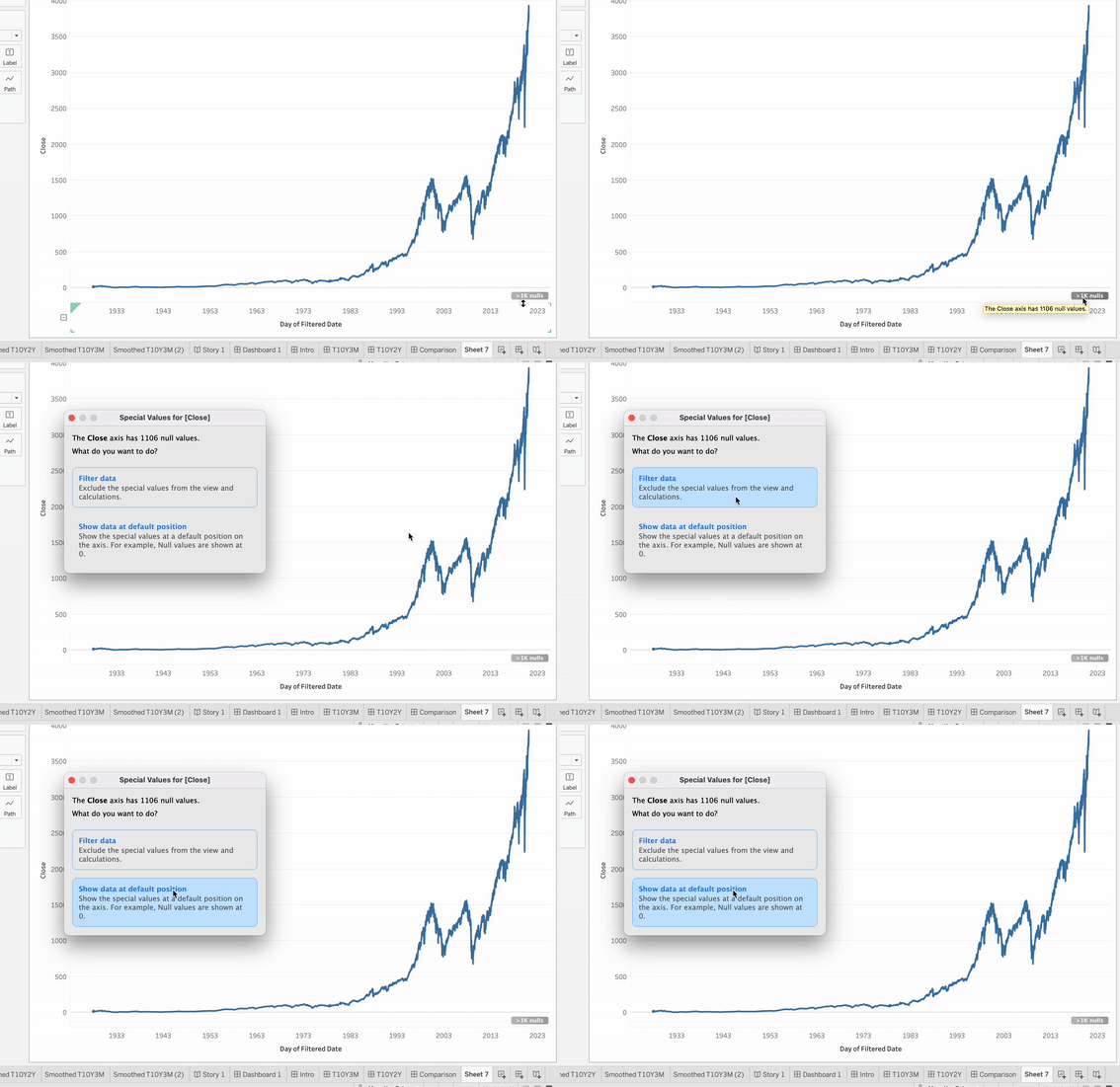
Sometimes Tableau’s UI can be misleading. If you’ve had the NULL values indicator pop up in the bottom-right corner of one of your worksheets, then this is one of those misleading times.

A simple click on the indicator would suggest there are two options to handle NULLs. The first would be to filter the data. The second option is to show data at the default position.

Clicking on the Null indicator will pop up this option box

This window is standard for non-geographic worksheets. Geographic worksheets will instead show this window:

https://help.tableau.com/current/pro/desktop/en-us/datafields_specialvalues.htm

But there are actually other options available outside of these!

The Quick Tip

Let’s say you want to leave everything as-is, but don’t want to have that ugly NULL bubble in the bottom right corner of your worksheet view. The way you can do that is LITERALLY THE EASIEST THING EVER. Yet I didn’t learn this until a couple years until my Tableau journey. Ok, now don’t be mad when I tell you this…

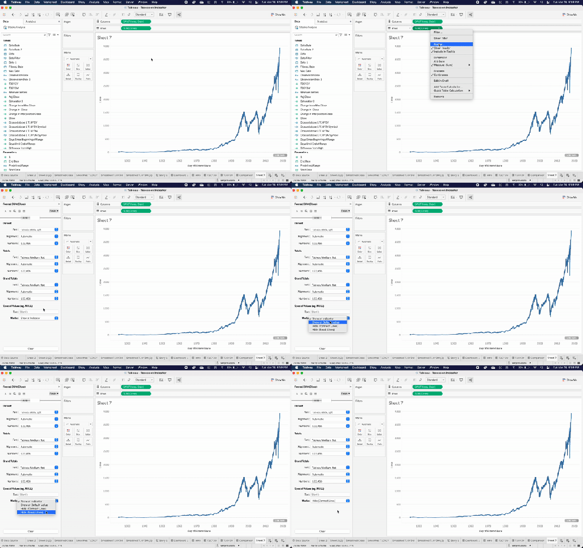
Right click the indicator and select Hide.

Yup. That’s it. Here’s a gif of me doing it:

Seriously, it’s that easy.

Be aware that Tableau will choose the specific behavior of hiding the indicator. This means that for something like line charts, it could hide the indicator and keep the line connected. But if you wanted to control that behavior and break the line instead while hiding the indicator, you can use the method described below.

Another NULL Formatting Tip

There’s an additional method to handling NULL values in Tableau. This involves changing the formatting of the specific field.

  1. Right click any field, and select Format.
  2. Click on the Pane tab of the Format window.
  3. At the very bottom you’ll have a Special Values section for Text and Marks. Here you can enter an alias for the text values or select from one of four dropdown options for the Marks.
Right-click on any field you want to modify Special Values for.

That’s it. Hope this tip helps! Please send me an email (dan@mywebsiteURL) if this post helps or if there are other topics you’d like covered!

Categories
Meta Tableau

The hardest part about making dashboards for Tableau Public

Tableau Public is great. It’s a free option for data visualization developers to publish their Tableau work for the world to see. No matter if you’re a fresh, new developer or a seasoned expert.

Publishing to Tableau Public is great because it does a few things:

  • Let’s you work on you Tableau skills at home without spending $$$ on licenses
  • Gives you a community to participate in
  • Is a great way to help share and learn best practices and tips & tricks
  • Helps build a portfolio for potential employers or customers

I publish to Tableau Public every so often. Oftentimes I’ll share my works to LinkedIn and/or Reddit to get feedback and hopefully give new insights to viewers across the world. Doing this has often reminded me of a very important fact.

Feedback is a critical part of development.

This doesn’t just apply to Tableau Public. It applies to nearly all work. You need your alone time to brainstorm, develop, tinker, and fail. But you also need some sort of collaboration and feedback in order to make the best version of your product.

That’s why the lack of feedback while developing for Tableau Public can make development difficult. In an ideal development world, you get a few rounds of feedback. Without these iterations of feedback, development can be like a brutal empathy exercise. Trying to figure out what the opinions and thoughts of the end users without actually ever talking to them! Let’s break this down.

Challenges of feedback

  1. Knowing how often and when to get feedback.
  2. Finding experienced, truthful and knowledgable people to provide feedback.
  3. Understanding which recommendations to ignore and which ones to take action on. Experience helps with this one, but so does finding a great person for point 2 above.

Some ideas on how to establish a feedback loop for Tableau Public projects

Getting some sort of feedback loop can bring your dashboards to the next level. A great part of Tableau Public is that you can always open a dashboard you’ve published, edit it, and republish with the changes. I do this all the time when I want to make changes or test how something renders on different devices (**cough** **cough** fonts). So how can we establish a feedback loop so we can take advantage of this editing capability?

  • Get your spouse/roommate/friend/coworker to review your dashboard. Find out what they found hard to understand, if it was easy to use, and what they liked/didn’t like about the visual aspect. In person is great, at lunch is great, over video chat is great, any time and place it great! Just make sure your dashboard is configured for mobile if you’re doing it on the go.
  • Have regular chats with a mentor. If that mentor has Tableau experience, that’s awesome. But they don’t have to! A thoughtful mentor can give valuable insights regardless of their background. If you’re looking for a mentor, reach out to me. If you’re looking to mentor someone, also reach out to me (we all need mentors)!
  • Post your work publicly and ask for critique. This one you have to be careful with! Random internet strangers can be hit or miss. Some will type out “criticisms” without much thought or understanding. These should be ignored. But smaller communities and communities of respected colleagues, feedback can be invaluable. Think of places like LinkedIn, Meetups, small Facebook groups, etc.

Here’s my ideal feedback cycle (when to get feedback)

The first round of feedback is before you even start. It’s talking and asking questions with your target audience in order to nail down the KPIs, metrics, or business questions you want to answer with your work.

The second round is ideally after you’ve completed several mockups/potential solutions. Your target audience tells you what they like, what isn’t clear enough or useful, and you can gauge whether the audience is actually seeking what they’re asking for. (or really something tangentially related instead).

The third round would be after building the narrowed-down solution from the second round of feedback. In short, this is a post-beta version feedback round.

In the final round, this is where the least amount of changes would be requested and honored. At this point things should be pretty close to the desired outcome. Small changes might be done, but nothing drastic. If drastic changes are requested, then this is truly a new project and should be treated as one. That’s when you start back at round 1!


That’s it, thanks for reading!

Categories
Dashboards Data Tableau

Fails to Deliver and GameStop – A Look Inside

Note: Like what you see? I’m available for contract work! Reach out to me (407-906-6902) if you have an analytics project you’re looking to complete!

Click here to jump straight to the dashboard

You probably haven’t heard anything about GameStop in the past few years. Nope, nothing. Just a defunct retail chain where you used to be able to trade in your used video games for $3 a pop.

Sarcasm aside, the world was taken by storm a few weeks ago when GameStop stock went on a rally. With an exceptionally meteoric rise paired with high short interest, panic ensued for short sellers and smaller brokerages. This led to a rise in failures to deliver. In the most basic definition, this is one of the parties in a transaction did not deliver cash or the asset before the settlement date of the transaction.

Check out Investopedia’s definition below, and definitely read the page if you want to learn more about failures to deliver.

Whenever a trade is made, both parties in the transaction are contractually obligated to transfer either cash or assets before the settlement date. Subsequently, if the transaction is not settled, one side of the transaction has failed to deliver. Failure to deliver can also occur if there is a technical problem in the settlement process carried out by the respective clearing house.

https://www.investopedia.com/terms/f/failuretodeliver.asp

The SEC publishes data on failures to deliver twice every month. At the time of this posting, they had data released up to January 15th, 2021 (update: on Feb 16th I updated this with the SEC data up to January 29th, 2021). This unfortunately doesn’t capture the most extreme part of the GameStop stock price explosion, but captures other volatile periods in the stock’s history. I’ll update the visualization when the data becomes available.

In this dashboard, I wanted to see the correlation between price increases and fails to deliver. Also I was interested in seeing what the comparison was between the average of all stocks reported fails to deliver versus GameStop. Check out the visualization below to see what I came up with. It’s interactive and best viewed on desktop (but has a mobile configuration as well).

The Dashboard

p.s. if you know what stonks are then you know it’s not a misspelling. If not, don’t worry about it and enjoy the ride šŸš€šŸš€šŸš€

One last note is that this project was a great way for me to practice my Python skills. SEC.gov provided the files in two week chunks, each as a zip file. I made a quick Python script to download all of the data for the last year, unzip the folders, append all of the text files to each other, and output a nice csv to use in Tableau. Python is a semi-frequent skill for me so it’s always nice to have a quick touch-up project like this.

If you’re looking to learn Python, a project like this is a simple way to learn a real world use. Don’t be afraid to jump into projects like this. Break it down into tiny steps and complete one at a time.

Thanks for reading. Any questions or comments? Feel free to reach out to me via email on my contact page.

Categories
Tableau Tips

My Top 5 Quick Tips for Speeding Up Development in Tableau Desktop

Making the leap from beginner to intermediate, and intermediate to expert in any skill requires attention to small details. This includes paying attention to nuances in the way the skill is conducted. Tableau development is no different. What are some ways that a Tableau developer can hop into the next echelon of skill? I’ve compiled five of my favorite quick tips to speed up your workflow and take development to the next level.

1. Using a template workbook for common formulas, dashboard layouts, etc.

Unfortunately (or fortunately), you’ll be doing a lot of the same type of stuff while building different workbooks in Tableau. Certain things are done in many dashboards, things like:

  • Certain calculations
    • Year-Over-Year
    • Year-To-Date
    • Month-To-Date
    • Percent difference
    • INDEX( )
  • Certain views
    • BAN (Big Ass Numbers)
    • Highlight tables
    • Customized maps
  • Dashboard layouts

There are a couple methods you can use with template workbooks to be more efficient. First, you can swap out the data source and replace fields with your desired data source fields in order to use the template workbook exactly as it is. Secondly, you can copy and past specific calculated fields, parameters, sheets, dashboards, and more from the template workbook into the target workbook.

This methodology really comes in handy when building more complex visualizations. Things like radial bar charts, Sankey diagrams, waterfall charts, etc. These can be time-consuming builds that aren’t frequently created, meaning it’s difficult to get efficient at building them.

2. Using the control key (or command key for Mac) to duplicate things and select multiple objects instead of the context menu

Did you know Tableau let’s you duplicate and select pretty much anything using the control/command key?

  • Press and hold it while clicking and dragging a pill in order to duplicate it.
  • Press and hold it while clicking and dragging a pill onto one of the marks cards (color, size, etc.) in order to duplicate it as a different mark attribute.
  • Press and hold it while clicking and dragging a worksheet to duplicate it.
  • Press and hold it while clicking and dragging a dimension in the data pane to the measure area in order to create a count of that dimension field.
  • Hold control/command while clicking on worksheets, fields, or pills to make bulk actions

3. Utilize context menus instead of the menu bar

You might be tempted to create and edit calculated fields, format specific fields or elements, and do other things using the menu bar. It’s more efficient though to use context menus in their localized areas.

For example, right click on a field in the data pane and then click “Calculated Field in the “Create” menu in order to have the context field inputted into the calculated field formula window. A parameter would be similar in function. Basically a contextually created parameter would be automatically configured with that field’s relevant values as the list of values for the parameter.

4. Drag and drop things instead of using context menus

This tip is usually targeted at beginners. To remove pills from the view, there is no need to right-click each pill and then click remove. Instead just click and drag the pill out of the view to remove it. Use control/command to select multiple elements (or shift to select multiple sequential elements) and drag them off the view to remove them.

On a similar note, you can drag and drop fields onto specific parts of the view (columns, rows, marks, filters, pages, etc.) in order to get the desired visualization. Double clicking a field to add it to the view and then moving the field around can be much less efficient.

5. Copy and Paste Formatting

Make a change to one of your bar chart views? Need those changes in all of your other bar chart views in the workbook? Don’t event think about repeating the formatting manually!

Tableau offers a great functionality to copy and paste formatting, just like in Excel. Simply right click the target worksheets.


That’s it, thanks for reading!

Categories
Dashboards Everything Else Tableau

2020 Presidential Election: Florida early and mail-in voting participation

Election day is closing in! Let’s take a look at one of the swing states current voting stats: Florida. Florida releases early voting and mail-in voting statistics on their Division of Elections site. I used that data to build a visualization of current trends.

I’d recommend using the visualization below by opening the 2016 Presidential election results (Trump vs. Clinton) and comparing the county results versus the voter participation so far for each party. Voters aren’t guaranteed to vote strictly along party lines, and small deviations from parties can have a big impact in small margin states like Florida. That being said, it can be telling to compare the current votes for each county by party to the results in 2016.

This next part is using numbers from October 30th. For example, Miami-Dade in 2016 had 623,006 votes for Clinton and 333,666 votes for Trump. Currently Democrats have 352k votes and Republicans have 269k votes in 2020. 225k unaffiliated voters have cast a ballot as well. This could mean several things (if we irresponsibly assume people 100% vote along party lines):

  • Republicans have already voted around 81% of their vote total from 2016.
  • Democrats have already voted around 57% of their vote total from 2016. Democrats have about 200k more registered voters in Miami-Dade, but if their participation doesn’t increase significantly, this could indicate an overall negative change in demographic voting for the party across the state.
  • If Republicans keep voting at this rate and the county gets around 75% voter participation, Trump will significantly outpace his 2016 total for Miami-Dade. In 2016 Clinton won Miami-Dade county by a margin of 29 points, but decreased Democratic turnout could narrow that margin significantly.
  • It still all comes down to the voters with no party affiliation. These voters make up 26% of registered voters in Florida, and nearly 33% of voters in Miami-Dade county.

With that in mind, take a look at my viz below! Make sure to hover and click to see additional information.


Interested in getting more posts like this? Subscribe below (I never share my email list with any 3rd parties).

Processingā€¦
Success! You're on the list.
Categories
Everything Else

Twitter still hasn’t unlocked the New York Post’s account

Related Article: What could polls be missing for this election?

Update: Twitter finally unlocked the New York Post’s account on October 30th. This occurred after the Senate Commerce Committee interview multiple Tech CEOs, including Jack Dorsey of Twitter.

Disclaimer: I’m a registered voter with no party affiliation. I have a personal interest in tracking major news networks such as CNN, Fox News, Breitbart, the New York Times, and other outlets who publish misleading information since 2008. Twitter is a recent example of a large, influential medium that has now subjectively interfered with information flow to the public.

It has been over 10 days since the famous New York Post story discussing Hunter Biden’s activities with the Ukranian energy firm Burisma. Twitter reacted by locking the New York Post’s Twitter account from any activity, citing they were trying to prevent the spread of hacked information. Twitter CEO Jack Dorsey admits blocking the story was a mistake and ended up reallowing the sharing of the story on Twitter.

Then one must ask, why is the New York Post’s Twitter account still locked?

If the decision was reversed, why isn’t the New York Post’s account unlocked? Why isn’t the New York Times account locked due to releasing Trump’s tax returns that were clearly stolen or “hacked”? Especially after the New York Times declined to share their evidence? Here’s a quote from the NYT article where they decline to share:

“…Alan Garten, a lawyer for the Trump Organization, said that ā€œmost, if not all, of the facts appear to be inaccurateā€ and requested the documents on which they were based. After The Times declined to provide the records, in order to protect its sources…”

https://www.nytimes.com/interactive/2020/09/27/us/donald-trump-taxes.html

So no records have been released “in order to protect sources”, which isn’t an explanation as to why the actual documents haven’t been published. You can publish tax returns without exposing your sources (for an example, look at all of the WikiLeaks releases over time). Ironically, by publishing the tax returns, you’ll force the hand of Trump to actually release his returns. Instead, all we have is the NYT claiming to have records that they won’t show and have obtained without permission. So why is the New York Post account locked and the NYT account not?

A speculation

Maybe the answer lies in Twitter’s rules and policies, which give plenty of wiggle room by utilizing “exceptions” that they alone determine is best for the public interest. Apparently unverified and unreleased tax returns are important for the public interest, but direct evidence of high-ranking US politician’s family member receiving a highly paid position without prior credentials is not of concern to the American public.

Maybe it turns out that Twitter is in fact biased? Considering it’s difficult, if not impossible for a human being to truly be entirely objective, Twitter’s review units are undoubtedly biased themselves since they’re made up of humans. Should there be insights into who makes up the committees that Twitter uses to review posts and their potential biases? Either way, the main question is; why are they subjectively trying to change the flow of information to the American public?

You’ll have to come to your own conclusion on that.

To be transparent, this is my opinion.

Any institution (private or public) with the power to influence outcomes of anything at scale, are incentivized to take a side. Since humans make up these institutions, they are inherently biased, no matter how hard they try to be unbiased. The resulting bias from the institution’s parts eventually come through as the bias of the whole institution. It’s inevitable and unavoidable, and this is what we’re seeing on Twitter’s decision to lock the New York Post’s account but not the New York Times.

The New York Post should be able to post their own articles without limitation unless other media outlets are restricted as well (such as BuzzFeed news). Unless every single news article is researched by a transparent committee with their justification on blocking/allowing it, one side will always benefit.


Usually I write about data stuff, but sometimes I write articles like these. Subscribe if you want to get notifications of new articles!

Processingā€¦
Success! You're on the list.
Categories
Everything Else

What could the polls be missing in this Presidential election?

Recently I wrote an article on the New York Post’s Twitter account still being locked. This is still the case, and it made me brainstorm many other topics associated with elections . This thinking session brought up the topic of polls and predictions. How accurate are they? Why were many polls so far off in 2016? Why do polls seem to tighten the closer to election day? [1][2]

Many polls are predicting Biden to win by a large margin, and many of the points I make below indicate factors that could make the margin much smaller. The one factor that could cause a greater margin than predicted would be an increase in Black and Hispanic voter participation. This is due to the fact that Biden still holds majority over those demographics so an increase in the total number of voters would benefit him the greatest.

Here’s what I think the polls could be missing

Narrowing party registration gaps, especially in swing states.

There are indications that Republicans have significantly closed the registered voter gap, especially in swing states. Trump narrowly won the 2016 election in many of these states, so a lesser difference between registered Democrats and registered Republicans could indicate Trump holding his lead in swing states. Of course, non-affiliated voters still hold a large chunk (often 20%+) in swing states, so nothing is set in stone.

Unwillingness for people to truthfully poll, especially for a candidate like Donald Trump.

Some studies have shown that people are unwilling to share their vote choice with polls. The study linked states that around 11.7% of Republicans don’t share their truthful choice with polls, 10.5% of non-afiiliated, and 5.4% of Democrats. That’s certainly not insignificant.

Shifting demographics in the Black and Hispanic vote.

If the Black and Hispanic vote turnout is the same or less than 2016, this will be a net negative impact for the Democratic party. Trump closed the polling gap from 2016 between both these demographics (although still doesn’t poll above 50% for either demographic). So if the total pie of votes for Black and Hispanic voters doesn’t increase, Trump takes a bigger portion of a pie the same size as 2016.

Increasing distrust of media and technology amongst conservatives.

If a person doesn’t trust the news, believes they’re being censored, or is generally less trusting in institutions, why would they answer truthfully to polls? Why would they participate in the polls in the first place? Are polls even further off than the “shy” voters study linked in the truthful poll section above?

Unknown voter turnout for the Black and Hispanic vote.

2016 saw a decrease in participation with these two demographics. If participation is higher than anticipated, it will significantly benefit Biden and result in a landslide win.

Wrapping it up

While many polls try to adjust for factors like these, it’s impossible to accurately measure all the variables associated with elections. For example, every time that Florida has seen under a 4% party registration spread, Republicans have won the state, anything above 4%, the Democrats have won. Right now the spread is under 2%. But mail-in voting will be at an all time high, so will overall participation increase or are only active voters shifting their voting method?

Many polls will correctly predict the election within their margin of error. The only issue is that it’s not useful in states consistently decided by less than the typical margin of error (like Pennsylvania and Florida).


Enjoy the content? Subscribe below to get notifications of new posts and access to subscriber giveaways.

Processingā€¦
Success! You're on the list.
Categories
How-To Tableau Tips

Quick Tip: Filtering and Searching in Tableau’s Data Pane

Did you know that Tableau Desktop has the option to filter the data pane by field types on top of just their names? With the introduction of data models in Tableau Desktop, I see a lot of users frustrated with the seemingly crowded data pane. Before the data model, you used to have dimensions and measures in separate sections in the data pane, but now everything is grouped by tables of your data source. The good news is that Tableau actually still has an intuitive way to quickly see the fields you need.

As of 2020.3 you can filter your searches by 4 different queries:

C: filters for calculated fields
M: filters for measures
D: filters for dimensions
F: filters by comments

By typing C: or any of the other options at the beginning of your search, you’ll filter all of the fields based on that category. After the type filter, just put the field name you’re looking for to filter further.

There are technically two ways to filter your searches. You can manually type in the values above, or you can use the filter button located to the right of the search bar. Take a look at the GIF below to see.

Here we manually select the filter type using the button to the right.

That’s all there is to it! Tableau has some great documentation on further things you can do in the data pane as well, take a look: https://help.tableau.com/current/pro/desktop/en-us/datafields_dwfeatures.htm

This has been a quick tip that will hopefully make your Tableau Desktop development workflow a little easier. Make sure to check out the other quick tip articles to level up your development!


If you found this post helpful, subscribe below! I’ll be releasing some tutorial videos soon, and my subscribers will be the first to see them!

Processingā€¦
Success! You're on the list.